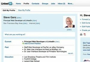
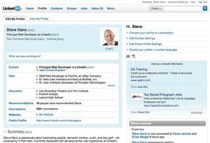
It’s official, LinkedIn is testing the new look. Some will see it, some will not. According to the new design started a few months ago after years of pouring over data of usability research. He says, “Armed with this information we began doing design explorations of how to better organize LinkedInfeatures, and make them more convenient to find and use.” While the folks at LinkedIn are focusing on the “What’s New”:
1. A global navigation bar at the top of the page that provides convenient access to all LinkedIn services.
2. Simplified local navigation within each of the LinkedIn areas (Profile, Contacts, Groups, etc.).
3. More room available for page content. Less scrolling.
4. A cleaner, less-cluttered look.
I am still sticking with that it is Lookin’ A Lot Like Facebook with the most noticeable change being your home page.
photo credit: Mashable
The layout and look of how your profile is viewed by others has changed as well.
Photo credit: LinkedIn
If you do not have the new LinkedIn here is a glimpse of how it will look when it is available to everyone. Are we going to see a change in the way new applications and sites are created? From blog comments to Twitter to Facebook and now LinkedIn, are we becoming a photo with text next to us in everything?
What do you think?

